Class Track
<u>Class Track</u>
A UX/UI/FE DESIGN PROJECT - A TOOL FOR SCHOOL STAFF COMMUNICATION
About the Project:
After spending 8 years in a variety of public school settings, it was often a challenge to simply communicate between staff during a busy school day. I wanted to finally add something to my portfolio that was rooted in solving a real problem that teachers face daily. I luckily was not alone for this process! If you would like to see a digital presentation of this case study, check out my Behance page.
Timeline & Team:
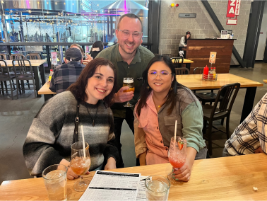
My 2 classmates, Gabby (left) and Ali (right), joined me after a brief project pitch to the class, and we quickly began the design process for this tool, ranging from UX Research to User Interface Design to Front-End Development. We had 3 weeks for the full design process from start to finish that involved UX and UI designers that were learning the front-end process.
My Role:
UX/UI/FE Designer & Educational Technologist
The Scenario:
Imagine that you're a teacher in a public middle school and you serve 135 students over a 7 period school-day. This schedule involves 8 different passing-times with hundreds of students moving between rooms, floors, and hallways over a 6 minute window.
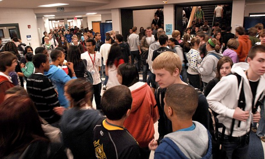 As a staff member, you are required to be present in the hallway to supervise and assist with the flow of students. As your classroom fills with students for the next hour ahead, you cannot be present at your district-issued desktop computer during these times, so getting critical student and school information is often diffcult.
Your leadership team and general staff relay information in a vartiety of ways. Many methods are used ranging from walkie-talkies to Email, Team chat, or simply just chatting in-person. You begin to miss out on key information. You feel lacking for students who are in crisis at times, and you know the tools are there for immediate messaging, yet you can't rally your staff to communicate with consistency. Here is where Class Track comes into play.
The Problem:
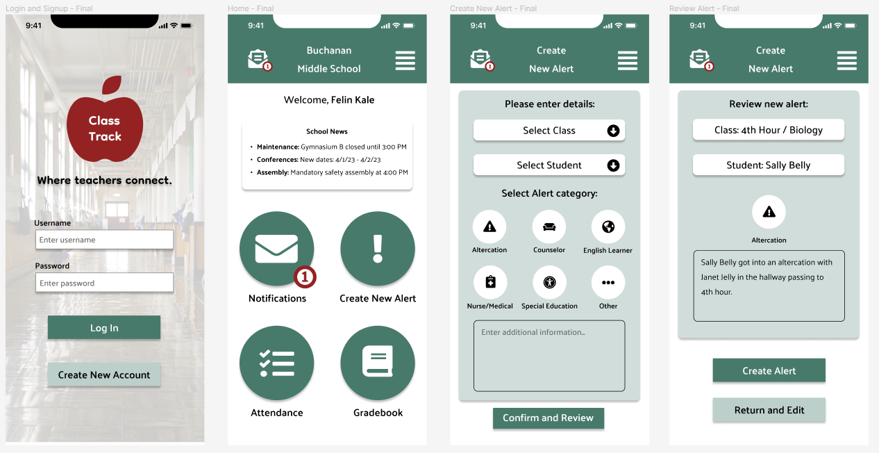
Most public school teachers have too many ways to receive and send information during a school day. A typical day is very busy with many moving parts, so information is needed quickly and accuratley. What tools staff choose to use depends on a lot, and a lack of consistency leads to lapses in daily communication. This issue is where our team began researching with crafting one central tool that school staff can utilize on mobile or desktop, with any device. The tool, Class Track, allows staff to relay messages about students, meetings, incidents, and anything that helps keep the day-to-day flow of school moving smoothly.

The Solution:
Class Track allows staff to relay messages about students, meetings, incidents, and anything that helps keep the day-to-day flow of school moving smoothly. This app was designed with teachers and administrators in mind to utilize mobily with phones, yet also offered for desktop use. Simple and efficient, staff can feel connected for whatever the schoolday brings.
Design Process:

User Research & Analysis
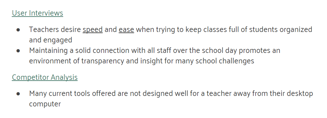
The User: Teachers, counselors, & administrators are the main groups to utilize this design. These individuals work on a fixed, daily schedule with many moving parts. They require speed, efficiency, and accuracy.
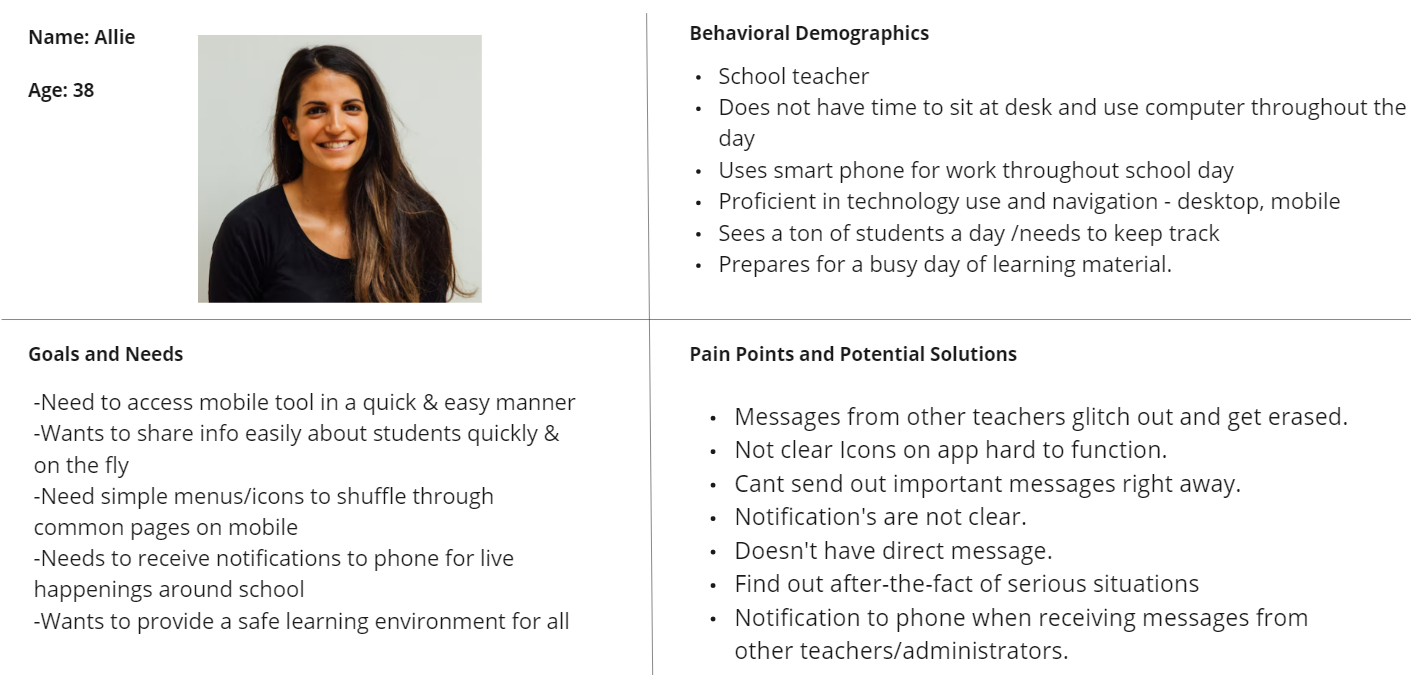
Being an educator with experience in a handful of settings, I had an important role to play with not only UX/UI/FE design that made sense, but also with maintaining accuracy with our design so that it realistically served educators. Creating an accurate persona and gaining early user data was a solid place to start.
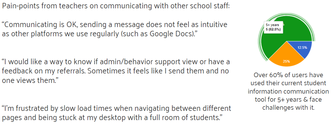
User Survey:
A brief Google Form to get our team on the right track.
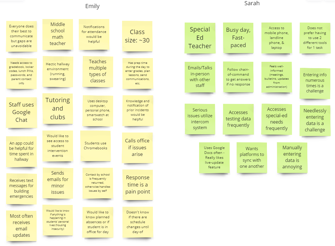
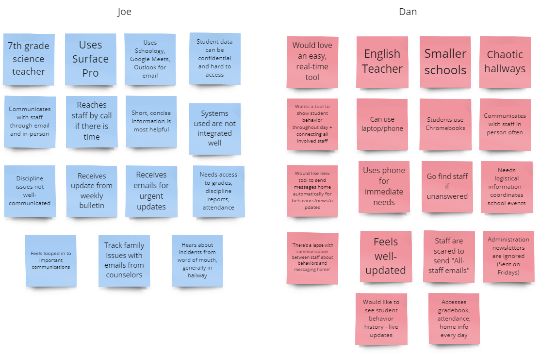
User Interviews:
Around 20 questions for our users about communication at their school and their needs.
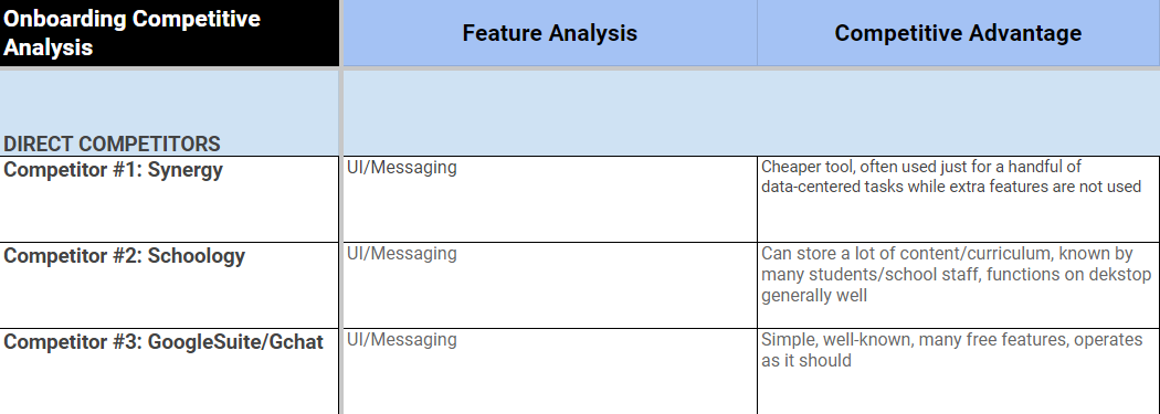
Competitor Analysis:
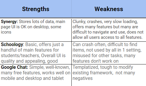
This analysis involved 3 popular tools for communicating in school settings: Synergy, Schoology, & Google Chat.
Research & Interview Takeaways:
User Persona:
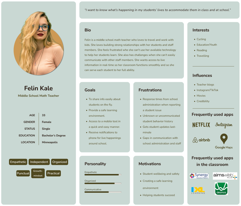
Our user advanced as we began to pinpoint specific challenges teachers face with communicating.
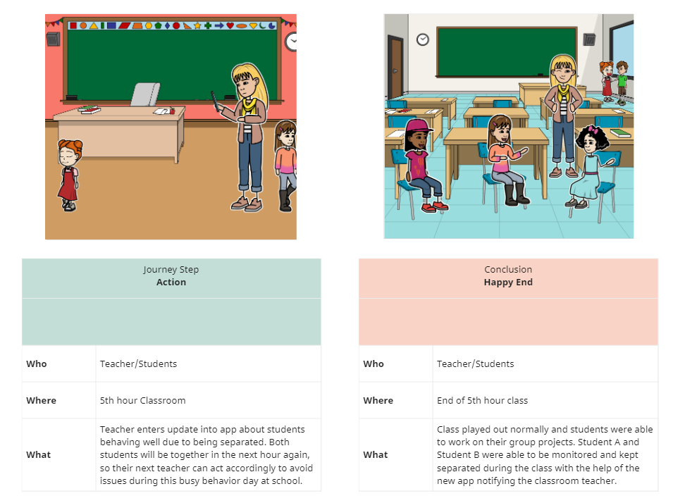
Storyboard:
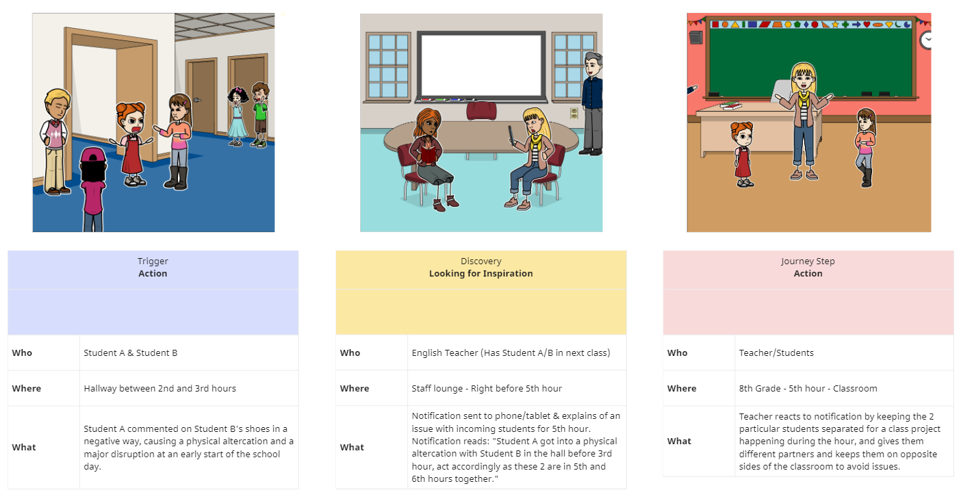
By placing our user in a scenario, this ultimately helped us pitch this idea more effectively to stakeholders.
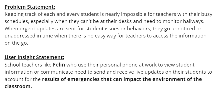
Problem & User Insight Statements:
Brainstorming & Ideation
Being an educator with experience in a handful of settings, I had an important role to play with not only UX/UI/FE design that made sense, but also with maintaining accuracy with our design so that it realistically served educators in a productive way.
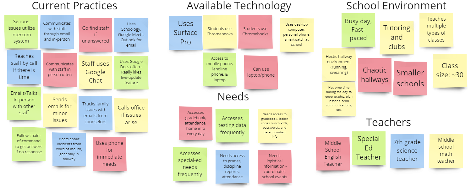
Affinity Map:
This tool helped us classify what's possible and what's realistic with our design vision.
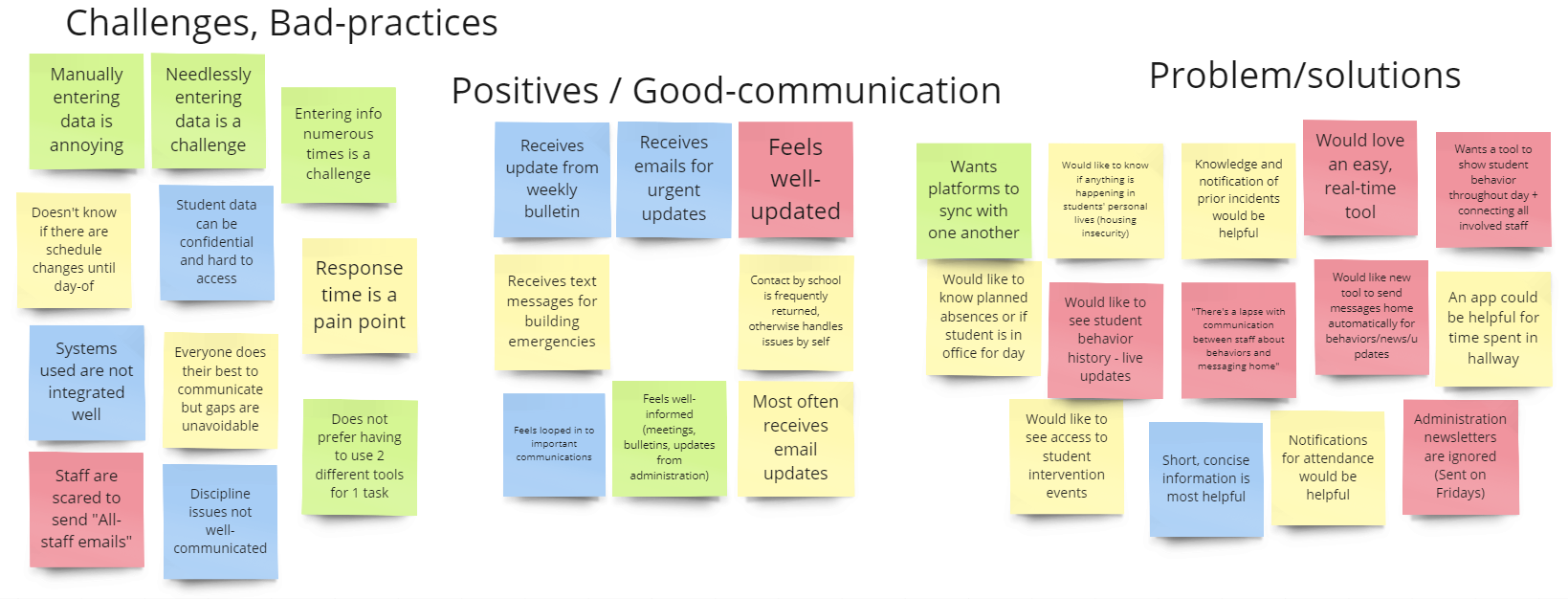
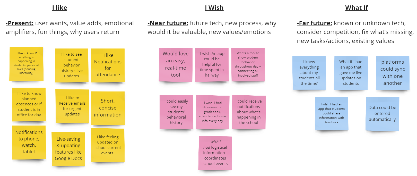
Likes, Wishes, What if's:
Users gave us insight into what would help solve their problems the most in a current/ideal world.
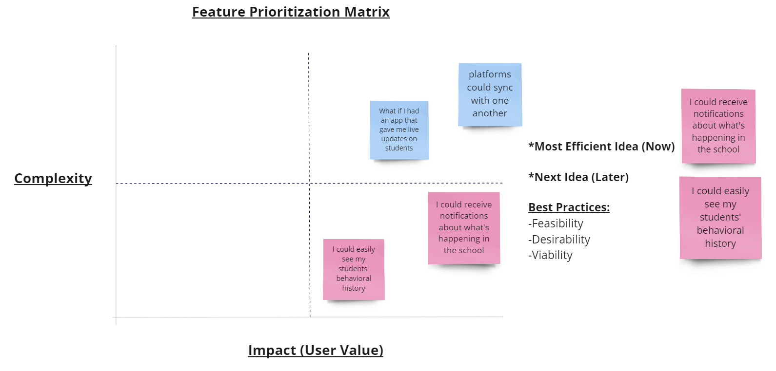
Feature Prioritazion:
A challenging part of any design process, yet we narrowed down what our focus would be.
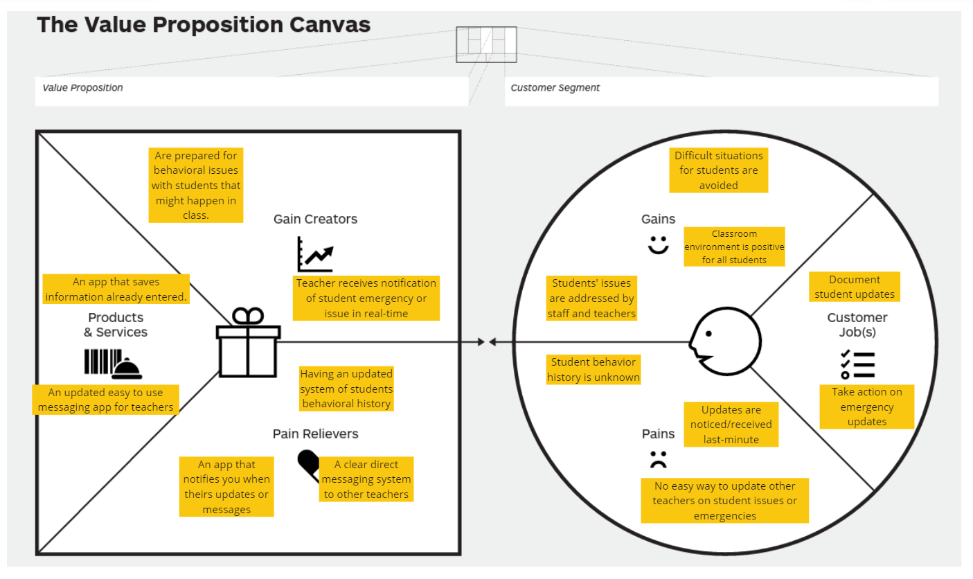
Value Proposition:
Narrowing down further the specific communication-need with this tool.
User Testing
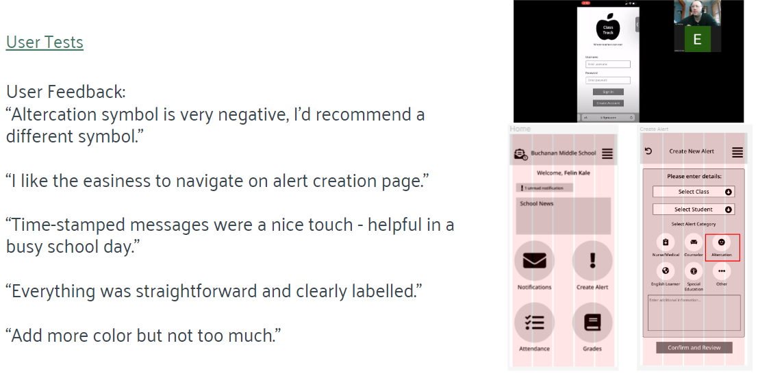
Testing demanded that we work with teachers and school staff members to get a realistic idea of what to change and keep. There were a handful of themes that popped up during our tests, along with a few new insights we had not thought of before.
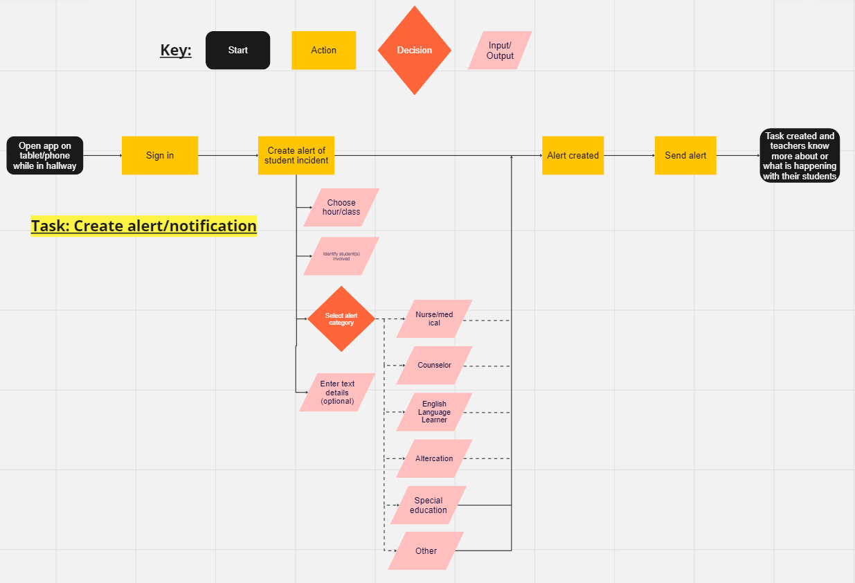
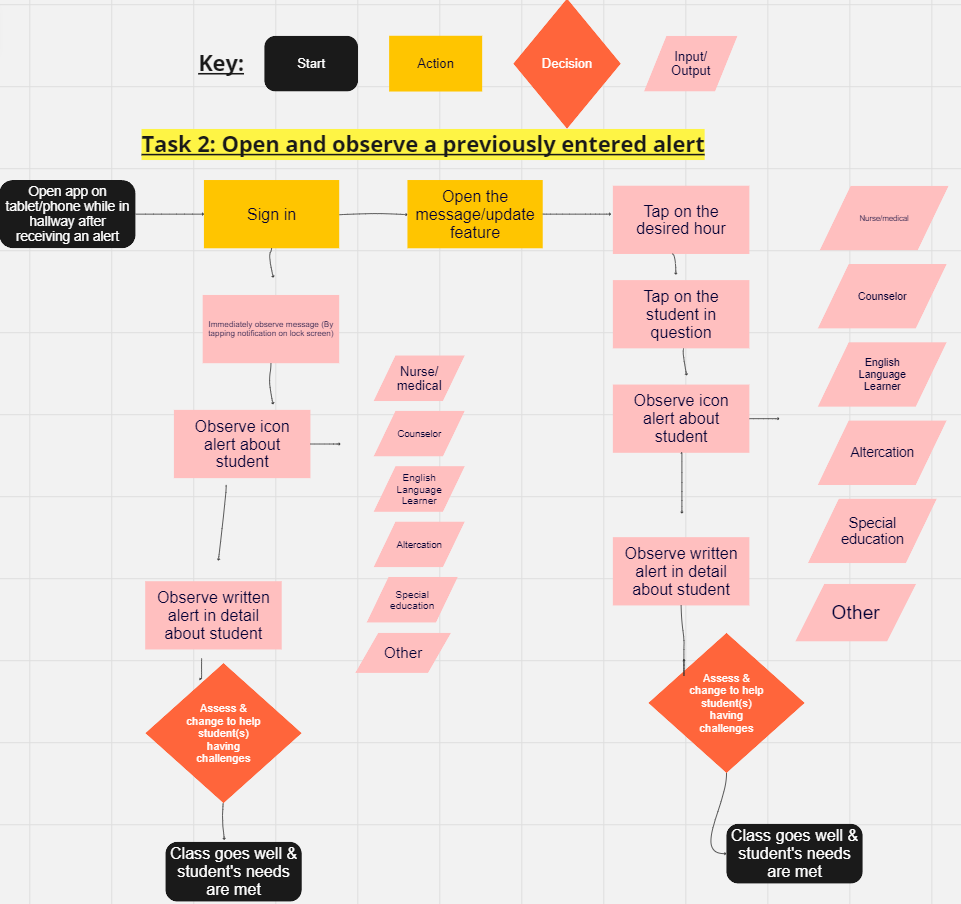
The 2 main tasks remained constant during our testing phases:
- Users can create an alert.

- Users can view an already created alert.

User Flow - Task 1:
User Flow - Task 2:
Wireframing, UI Inspiration, & Prototyping
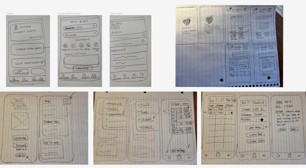
Being an educator with experience in a handful of settings, I had an important role to play with not only UX/UI/FE design that made sense, but also with maintaining accuracy with our design so that it realistically served educators in a productive way.
Paper Prototypes:
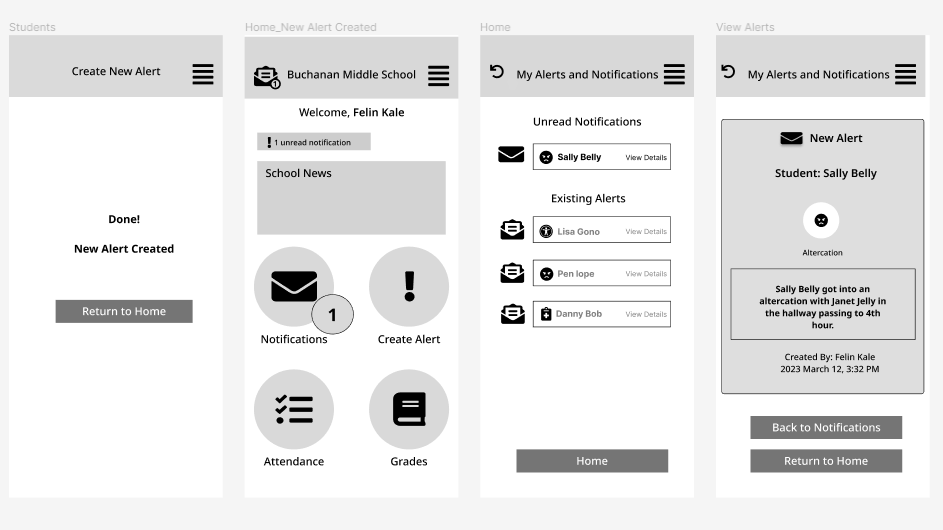
Wireframe Process:
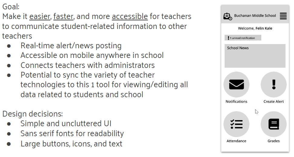
Wireframe Designs:
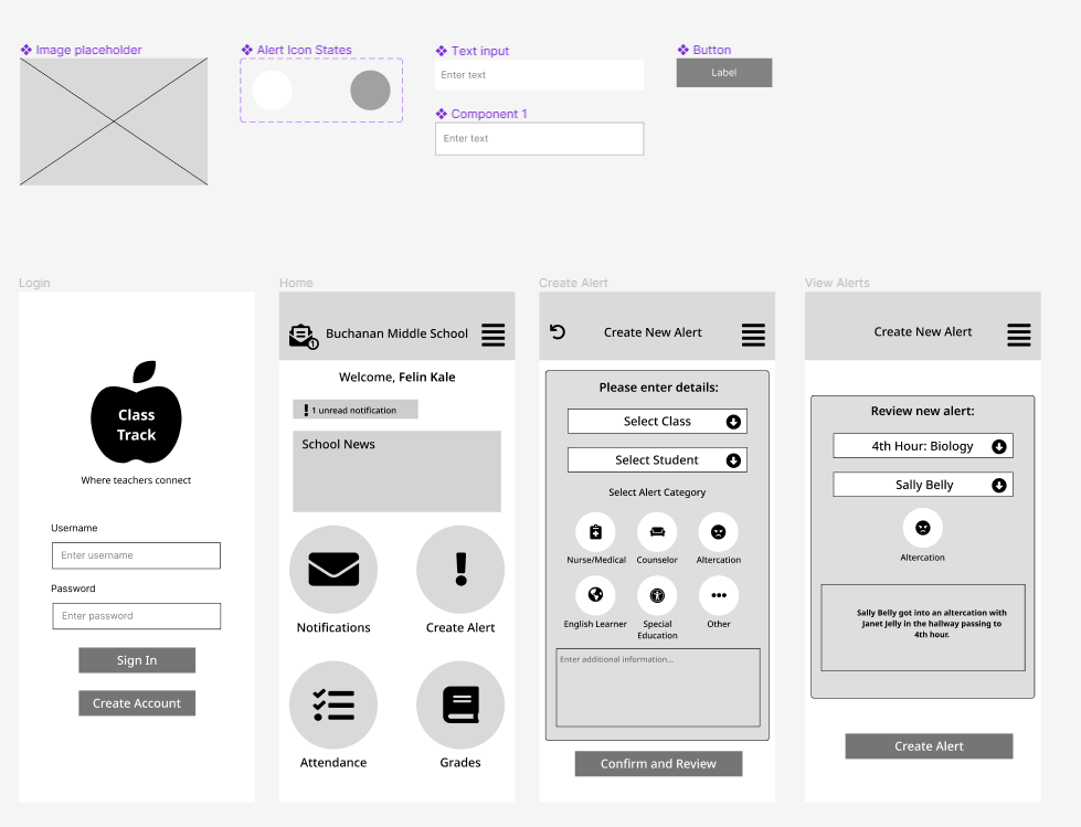
Wireframe Testing:
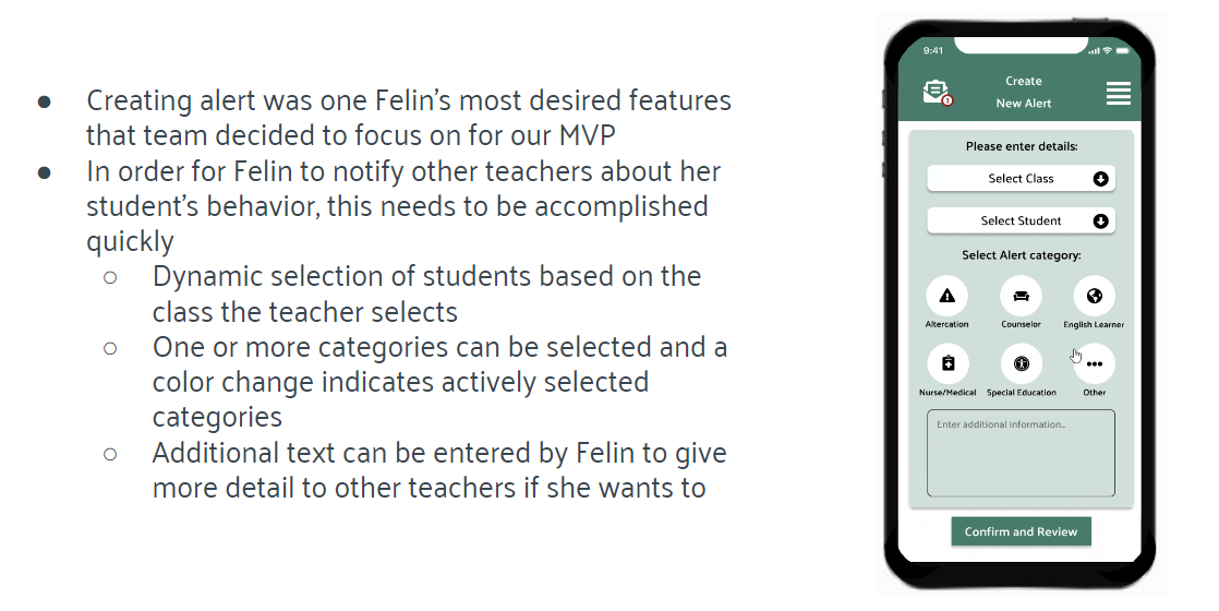
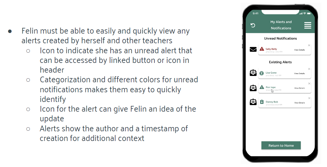
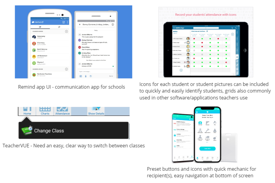
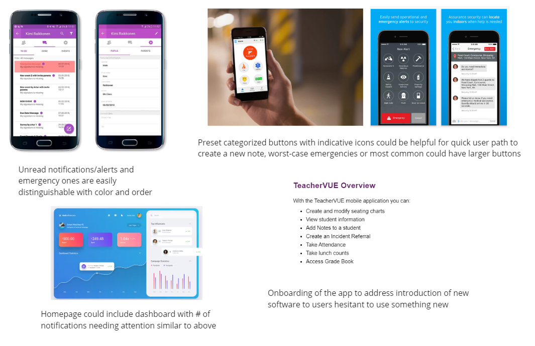
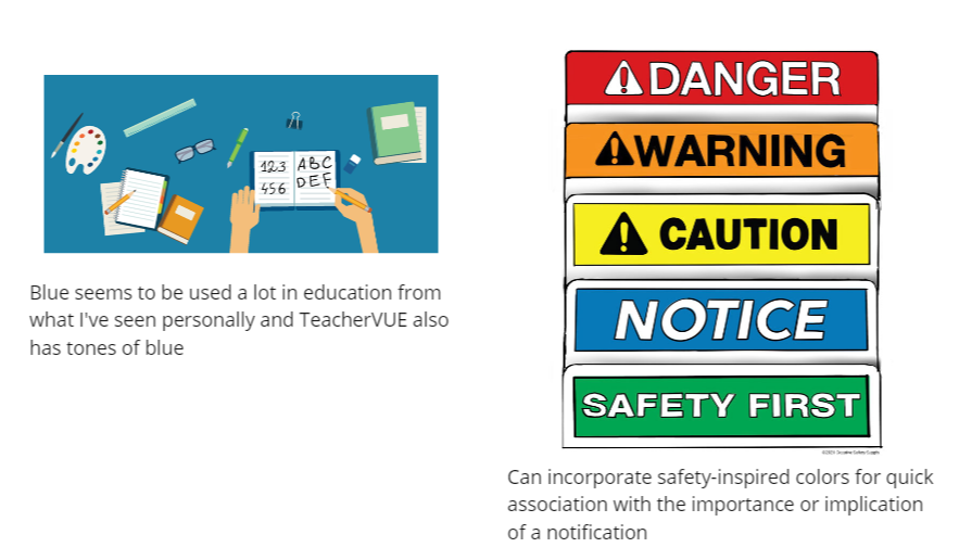
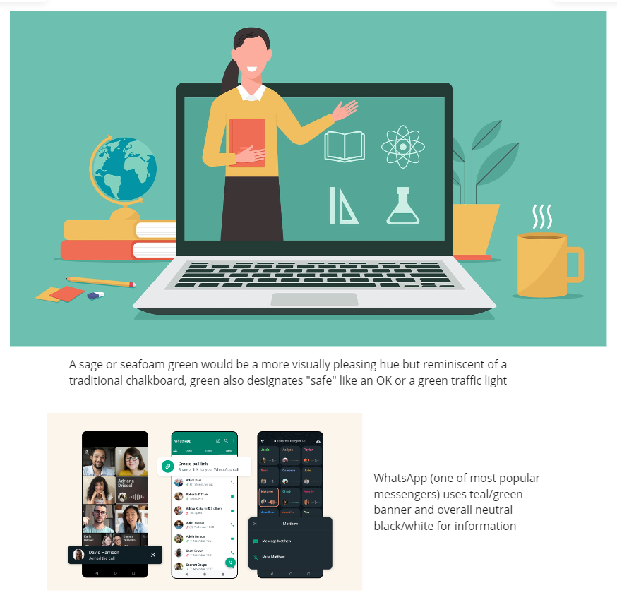
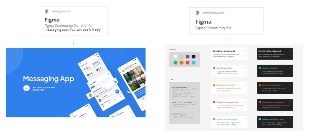
Wireframes began to develop into our final vision and high fidelity prototypes came to life. UI inspiration can be seen below with our reasoning. And as good design requires, bringing it back to our original user persona, Felin.
UI Inspiration:
Color Inspiration:
UI Kits:
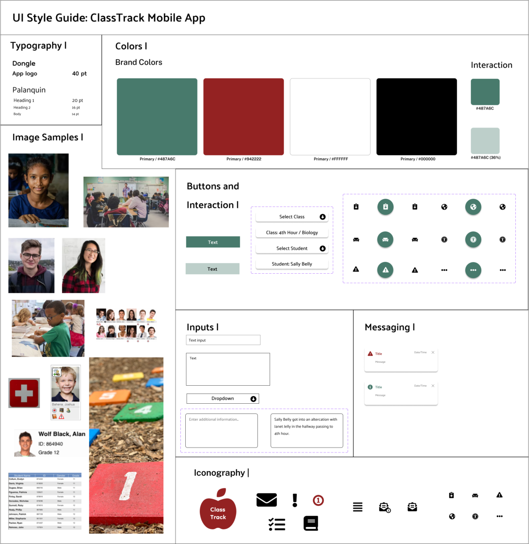
UI Style Guide:
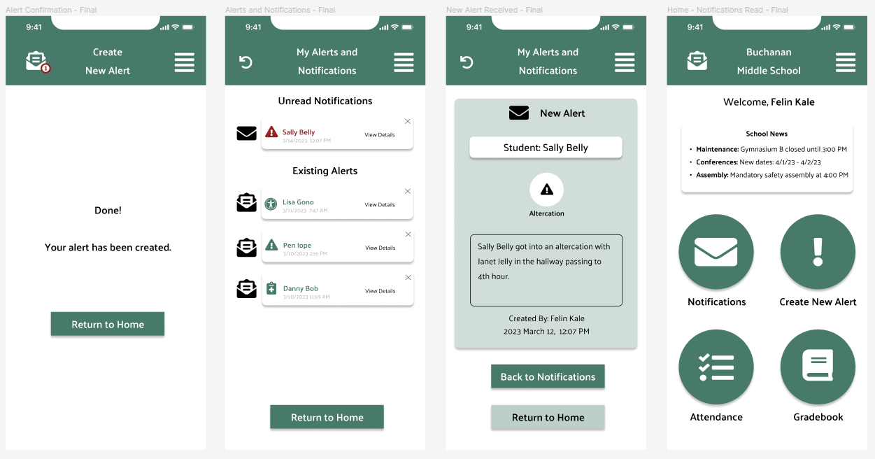
High Fidelity Prototypes:
The final phase that derived from multiple phases of prototypes, user tests, and iterations.

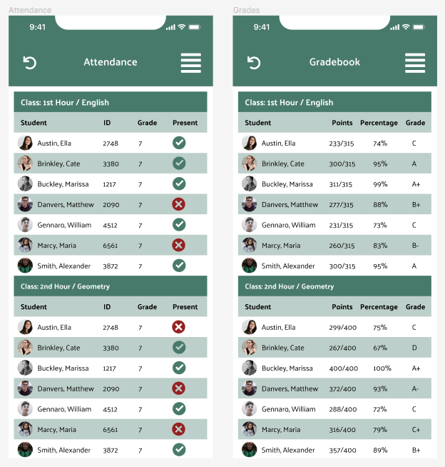
Additional screens for attendance and grades:
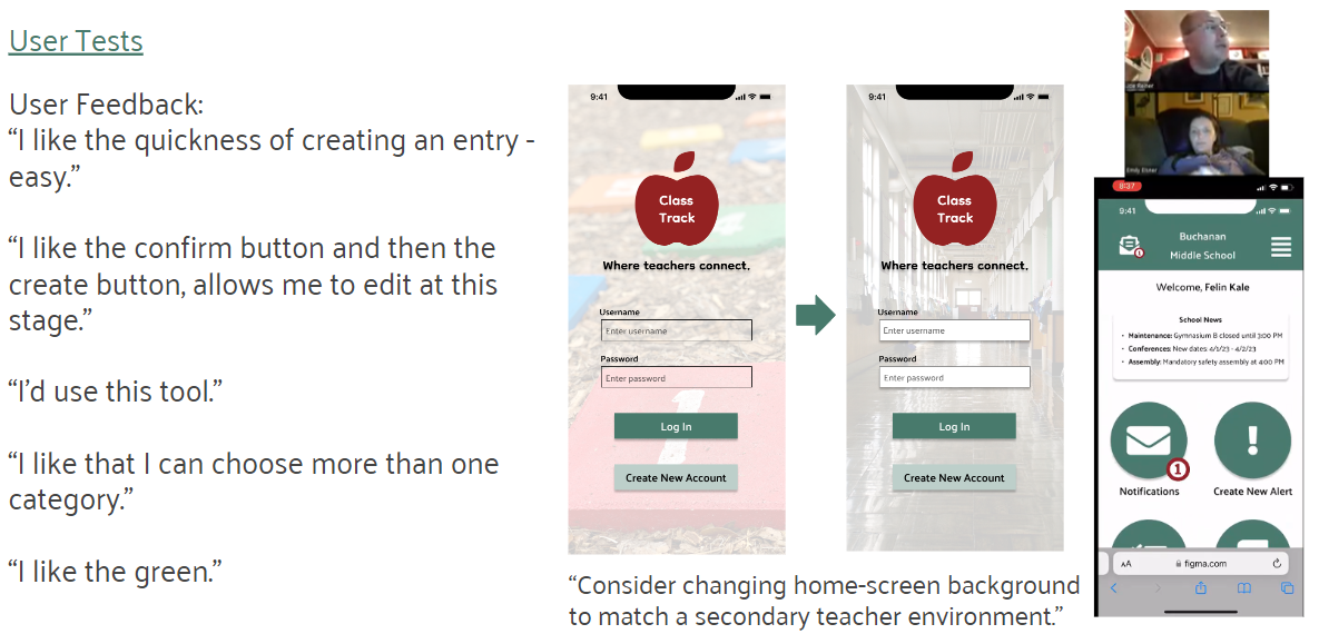
High-Fidelity User Testing:
Testing demanded that we work with teachers and school staff members to get a realistic idea of what to change and keep. There were a handful of themes that popped up during our tests, along with a few new insights we had not thought of before at the final stage of our prototypes.
Front-End Coding
Our team included a handful of languages to bring these prototypes to life. Through VSCode and Github, we utilized HTML, CSS, and a small amount of JavaScript and Bootstrap. Each member was in charge of the front end for a few screens of our prototype.
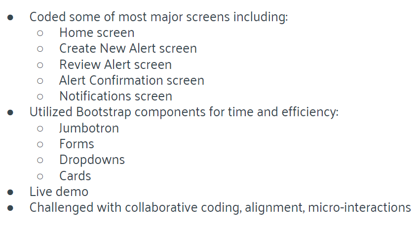
Red-lining the layout:
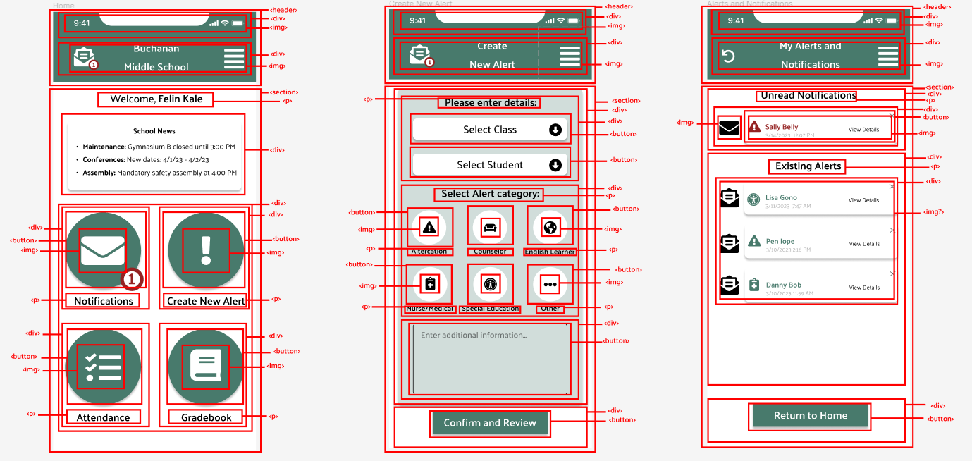
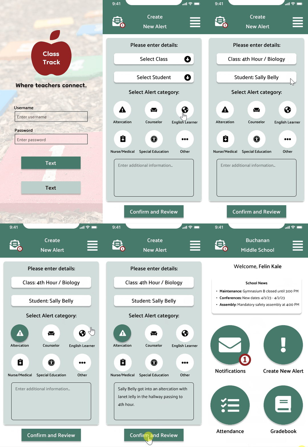
An alert being created.
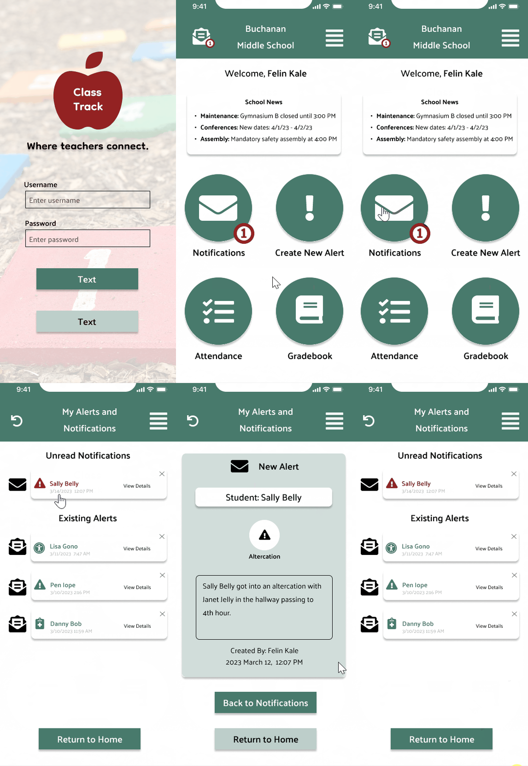
Viewing a notification.
The Result & What We Learned
Through the design process, we were able to refine our idea to a few much needed features; creating an alert and viewing alerts made by others. Users confirmed throughout testing how needed a tool like this is in a busy school environment.
Ideas we would like to add:
Adding functionality to the attendance and gradebook screens
Additional features such as a chat tool for teachers to quickly get in touch with each other on their phones
Offer a variety of symbols/scenarios for school systems to utilize based on their setting’s needs
A tablet version as tablets are a common tool used in school
Syncing and integration potential of the variety of teacher tools in use with this app
Final Thoughts:
Spend significant time preparing your UX research to save yourself difficulties in the long run
Always stay within the scope of your objectives and be realistic
Try not to complicate the front end process and stick to just a few languages
A series of slide decks can be found here that include all JR Design case studies.
About the Project:
After spending 8 years in a variety of public school settings, it was often a challenge to simply communicate between staff during a busy school day. I wanted to finally add something to my portfolio that was rooted in solving a real problem that teachers face daily. I luckily was not alone for this process! If you would like to see a digital presentation of this case study, check out my Behance page.
Timeline & Team:
My 2 classmates, Gabby (left) and Ali (right), joined me after a brief project pitch to the class, and we quickly began the design process for this tool, ranging from UX Research to User Interface Design to Front-End Development. We had 3 weeks for the full design process from start to finish that involved UX and UI designers that were learning the front-end process.

My Role:
UX/UI/FE Designer & Educational Technologist
The Scenario:
Imagine that you're a teacher in a public middle school and you serve 135 students over a 7 period school-day. This schedule involves 8 different passing-times with hundreds of students moving between rooms, floors, and hallways over a 6 minute window.
 As a staff member, you are required to be present in the hallway to supervise and assist with the flow of students. As your classroom fills with students for the next hour ahead, you cannot be present at your district-issued desktop computer during these times, so getting critical student and school information is often diffcult.
Your leadership team and general staff relay information in a vartiety of ways. Many methods are used ranging from walkie-talkies to Email, Team chat, or simply just chatting in-person. You begin to miss out on key information. You feel lacking for students who are in crisis at times, and you know the tools are there for immediate messaging, yet you can't rally your staff to communicate with consistency. Here is where Class Track comes into play.
The Problem:
Most public school teachers have too many ways to receive and send information during a school day. A typical day is very busy with many moving parts, so information is needed quickly and accuratley. What tools staff choose to use depends on a lot, and a lack of consistency leads to lapses in daily communication. This issue is where our team began researching with crafting one central tool that school staff can utilize on mobile or desktop, with any device. The tool, Class Track, allows staff to relay messages about students, meetings, incidents, and anything that helps keep the day-to-day flow of school moving smoothly.

The Solution:
Class Track allows staff to relay messages about students, meetings, incidents, and anything that helps keep the day-to-day flow of school moving smoothly. This app was designed with teachers and administrators in mind to utilize mobily with phones, yet also offered for desktop use. Simple and efficient, staff can feel connected for whatever the schoolday brings.
Design Process:

User Research & Analysis
The User: Teachers, counselors, & administrators are the main groups to utilize this design. These individuals work on a fixed, daily schedule with many moving parts. They require speed, efficiency, and accuracy.
Being an educator with experience in a handful of settings, I had an important role to play with not only UX/UI/FE design that made sense, but also with maintaining accuracy with our design so that it realistically served educators. Creating an accurate persona and gaining early user data was a solid place to start.
User Survey:
A brief Google Form to get our team on the right track.
User Interviews:
Around 20 questions for our users about communication at their school and their needs.
Competitor Analysis:
This analysis involved 3 popular tools for communicating in school settings: Synergy, Schoology, & Google Chat.
Research & Interview Takeaways:
User Persona:
Our user advanced as we began to pinpoint specific challenges teachers face with communicating.
Storyboard:
By placing our user in a scenario, this ultimately helped us pitch this idea more effectively to stakeholders.
Problem & User Insight Statements:
Brainstorming & Ideation
Being an educator with experience in a handful of settings, I had an important role to play with not only UX/UI/FE design that made sense, but also with maintaining accuracy with our design so that it realistically served educators in a productive way.
Affinity Map:
This tool helped us classify what's possible and what's realistic with our design vision.
Likes, Wishes, What if's:
Users gave us insight into what would help solve their problems the most in a current/ideal world.

Feature Prioritazion:
A challenging part of any design process, yet we narrowed down what our focus would be.

Value Proposition:
Narrowing down further the specific communication-need with this tool.
User Testing
Testing demanded that we work with teachers and school staff members to get a realistic idea of what to change and keep. There were a handful of themes that popped up during our tests, along with a few new insights we had not thought of before.
The 2 main tasks remained constant during our testing phases:
- Users can create an alert.
- Users can view an already created alert.
User Flow - Task 1:
User Flow - Task 2:
Wireframing, UI Inspiration, & Prototyping
Being an educator with experience in a handful of settings, I had an important role to play with not only UX/UI/FE design that made sense, but also with maintaining accuracy with our design so that it realistically served educators in a productive way.
Paper Prototypes:

Wireframe Process:
Wireframe Designs:
Wireframe Testing:
Wireframes began to develop into our final vision and high fidelity prototypes came to life. UI inspiration can be seen below with our reasoning. And as good design requires, bringing it back to our original user persona, Felin.
UI Inspiration:
Color Inspiration:
UI Kits:
UI Style Guide:

High Fidelity Prototypes:
The final phase that derived from multiple phases of prototypes, user tests, and iterations.
Additional screens for attendance and grades:
High-Fidelity User Testing:
Testing demanded that we work with teachers and school staff members to get a realistic idea of what to change and keep. There were a handful of themes that popped up during our tests, along with a few new insights we had not thought of before at the final stage of our prototypes.
Front-End Coding
Our team included a handful of languages to bring these prototypes to life. Through VSCode and Github, we utilized HTML, CSS, and a small amount of JavaScript and Bootstrap. Each member was in charge of the front end for a few screens of our prototype.
Red-lining the layout:

An alert being created.

Viewing a notification.
The Result & What We Learned
Through the design process, we were able to refine our idea to a few much needed features; creating an alert and viewing alerts made by others. Users confirmed throughout testing how needed a tool like this is in a busy school environment.
Ideas we would like to add:
Final Thoughts:
Spend significant time preparing your UX research to save yourself difficulties in the long run
Always stay within the scope of your objectives and be realistic
Try not to complicate the front end process and stick to just a few languages
A series of slide decks can be found here that include all JR Design case studies.